
Continuous innovation
Providing health to every corner of the world
-
Zhejiang SANLEO New Materials Co., Ltd. has been engaged in the production of sports goods for nearly 20 years. The main products include yoga MATS, foam shafts, PU sports balls and other fitness accessories, which are sold well in different countries and regions around the world. The factory occupies a floor area of 45,000 square meters, with a number of supporting production lines, focusing on providing high-quality products and first-class chemical technical support and services for the high-end market. SANLEO's mission is to be a leader in fitness and sports foam products and to continue to innovate to provide health to every corner of the world.
不断创新
为世界每个角落提供健康
-
浙江善力高科新材料股份有限公司从事体育用品生产近20年,主要产品包括瑜伽垫、泡沫轴、PU运动球和其他健身配件,畅销全球不同国家和地区。工厂占地面面积45000㎡,拥有多条配套生产线,专注于提供高品质的产品和为高端市场提供一流的化工技术支持和服务。善力高科的使命是成为健身和运动泡沫产品的领导者,并不断创新,为世界每个角落提供健康。
为世界每个角落提供健康
-
浙江善力高科新材料股份有限公司从事体育用品生产近20年,主要产品包括瑜伽垫、泡沫轴、PU运动球和其他健身配件,畅销全球不同国家和地区。工厂占地面面积45000㎡,拥有多条配套生产线,专注于提供高品质的产品和为高端市场提供一流的化工技术支持和服务。善力高科的使命是成为健身和运动泡沫产品的领导者,并不断创新,为世界每个角落提供健康。


Minimalist font design
More international temperament
-
The brand name is the brand logo, do not let the audience think indirectly, because the communication cost is too high. SANLEO logo design is based on English. To simplify, the use of minimalist all-caps design, in the details to increase the rounded Angle, the overall more stable, fuller, showing a professional international temperament.
极简的字体设计
更具有国际气质
-
品牌名就是品牌标志,不要让受众群体再间接思考,因为传播成本太高。善力高科以英文SANLEO为主进行标志设计。去繁化简,采用极简的全大写设计,在细节处增加圆润的角度,整体更稳重、更饱满,呈现专业的国际化气质。
更具有国际气质
-
品牌名就是品牌标志,不要让受众群体再间接思考,因为传播成本太高。善力高科以英文SANLEO为主进行标志设计。去繁化简,采用极简的全大写设计,在细节处增加圆润的角度,整体更稳重、更饱满,呈现专业的国际化气质。


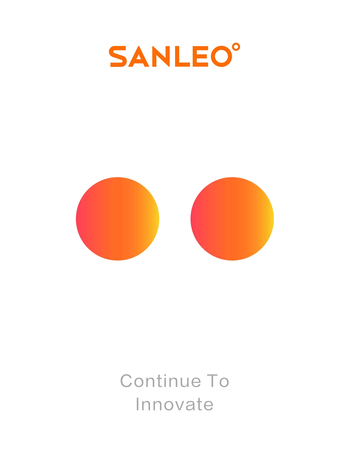
Vibrant orange
It's an upward attitude
-
In terms of color, we chose orange, which represents the vitality, to convey the positive and upward of the brand, and supplemented by dark gray and light gray, the stable color highlights the main color at the same time, in line with the brand's industry, and enhance the brand's professional and modern sense.
活力橙
是向上的态度
-
在色彩上,我们选择了代表了活力的橙色,以此来传达品牌的积极与向上,并辅以深灰与浅灰,稳重的色彩在突显主色的同时,以符合品牌所在的行业,并提升品牌的专业感与现代感。
是向上的态度
-
在色彩上,我们选择了代表了活力的橙色,以此来传达品牌的积极与向上,并辅以深灰与浅灰,稳重的色彩在突显主色的同时,以符合品牌所在的行业,并提升品牌的专业感与现代感。


Heart temperature
Circle of ideas
-
What does a symbol need to satisfy? This symbol is able to represent the industry, but also can accommodate later development. After a lot of attempts and comparisons, we finally chose the form of "foam" to present, with a simple shape and the golden section ratio, which represents the enterprise spirit of SANLEO to strive for excellence, and is also a temperature symbol, which is well-known and represents the humanistic spirit ofSANLEO to be sincere.
用心温度
理念之环
-
一个符号需要满足什么?这个符号是能够代表行业的,同时也是能够包容后期发展的。对比大量的尝试和对比,我们最终选择了“发泡”的形式呈现,以简约的造型,采用黄金分割比例,代表着善力高科精益求精的企业精神,同时也是温度符号,是为人所熟知的,代表了善力高科用心真诚的人文精神。
理念之环
-
一个符号需要满足什么?这个符号是能够代表行业的,同时也是能够包容后期发展的。对比大量的尝试和对比,我们最终选择了“发泡”的形式呈现,以简约的造型,采用黄金分割比例,代表着善力高科精益求精的企业精神,同时也是温度符号,是为人所熟知的,代表了善力高科用心真诚的人文精神。


From the Leo galaxy
Vitality IP: LEO
-
We have created an IP for the brand: LEO, which comes from the second half of the English name of the brand, which means lion, and the IP shape also comes from this, and the head and tail are combined by "bubble", representing the professional foaming technology of the brand. Set it to come from the Leo galaxy, and use the impression of Leo, such as vitality, sunshine and cheerfulness, to give the brand unlimited possible exploration power.
来自狮子座星系的
活力IP:LEO
-
我们为品牌塑造了一个IP:LEO,取自品牌英文名的后半部分,其意为狮子,IP造型也来源于此,头部、尾巴则是由“泡”组合而成的,代表着品牌的专业发泡技术。设定其来自狮子座星系,利用狮子座给人的印象,如活力、阳光、开朗,赋予品牌无限可能的探索力量。
活力IP:LEO
-
我们为品牌塑造了一个IP:LEO,取自品牌英文名的后半部分,其意为狮子,IP造型也来源于此,头部、尾巴则是由“泡”组合而成的,代表着品牌的专业发泡技术。设定其来自狮子座星系,利用狮子座给人的印象,如活力、阳光、开朗,赋予品牌无限可能的探索力量。


